Cirrascale
Always On
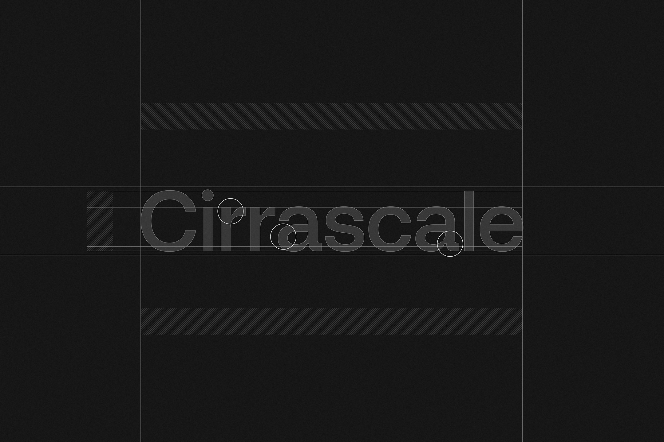
Cirrascale is a leading cloud services provider based in San Diego, California. Cirrascale purchased a Powerbomb sprint with the goal of rebranding their business. Cirrascale cut their teeth in hardware, producing one of a kind patented hardware stacks. Their steadfast innovation helped them secure partnerships with tech giants, supplying them with large scale compute infrastructure. As they moved into cloud computing, they continued to innovate in all areas of the category, but unfortunately their brand stayed stuck in the early years. As they scale nationally and globally, they needed a brand identity that aligned with their long term vision for the company. The rebrand needed to align with the industry leading tech they continue to introduce to the market. Fresh out of our stakeholder workshop, we were confident about the brand positioning and our recommendation based on the competitive analysis we did. Our solution is a high-tech visual identity with warm subtleties, which ground the identity system in human touch. We constructed a custom logotype to compliment the rest of the type system, Aeonik Pro, a flexible humanistic sans serif from CoType Foundry. We crafted the brand symbol with the same cuts as the custom wordmark, creating harmony and visual connectedness. To add depth to the identity system we created data visualization assets that are used as backgrounds as well as circular layering elements. Finally, we tie everything together using a geometric isometric illustration set that creates more dimensionality throughout touchpoints. The final result is a tech-forward brand identity that stays true to the customer-centric human touch at the center of Cirrascale as an organization.